
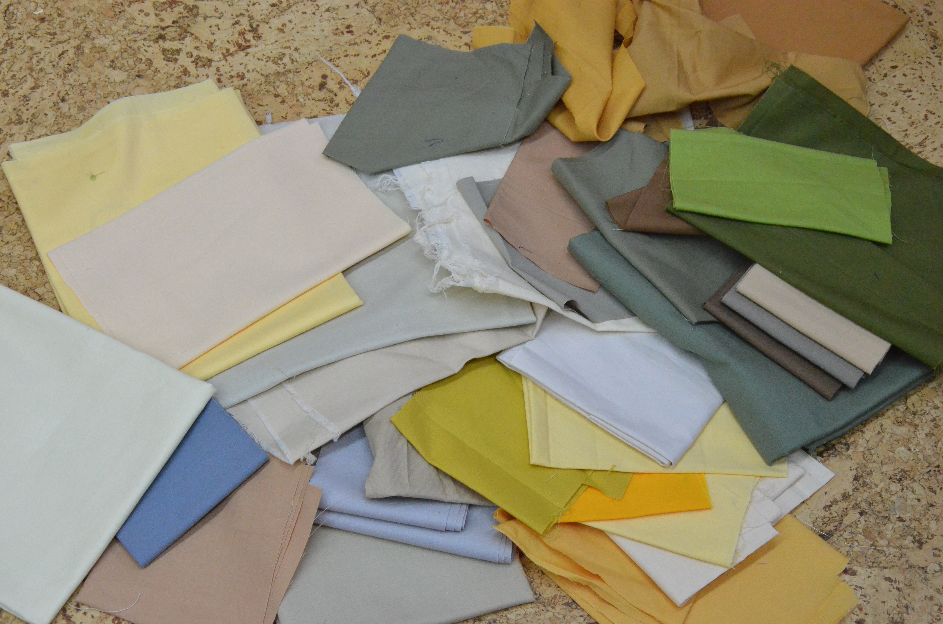
It all started with pulling a pile of Kona solids, yesterday, to use them up. I want new fabric but can not justify buying any more until I make a dent in what I own.
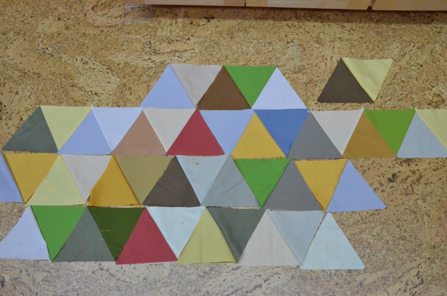
My first layout, trying to get what is in my head in to real life.
I decided more of the color, less of the neutral. These are 6″ finished sides on these triangles, meaning I cut strips 5 3/4″ wide, then used a 60° ruler to cut the equilateral triangles.
Then I wondered if maybe it was too busy with color so I covered some of the bolder colors with the more neutral ones. That is when I went to grab a Kleenex and noticed how close I was to someone else’s color design. And I do really like this design, too. It just wasn’t where I was headed, today.

I questioned that maybe it was beginning to lean towards being “too” neutral. Believe it or not I lean toward the calm, low volume, palettes myself, even if you don’t believe me based on the quilts I make….
Then another try. This one includes all of the first colorful palette but thinned out with more neutrals. Ehh… It’s missing something.

And the final plan.
Maybe a slight bit of rearranging, maybe not.
And honestly, it is a not quite as bold as it looks on my computer screen.
It definitely has the sunset look to it.

I like it!
Thanks Amanda for being on the other end of the computer screen through all the different variations.
It is much easier to be confident, of your design, when you have feedback from a trusted source.
And if she’s your daughter, she can read your mind.
Linking up with:
Design Wall Monday
and


I love it!
LikeLike
Thanks!
LikeLike
I love your colour squares and the last photo is best for me! x Teje
LikeLike
Thanks!
LikeLike
… me again. I posted today my colour triangles. For some reason the other comment links to my old blog. I hope to fix it now. x Teje
LikeLike
Glad you pointed that out, I didn’t realize you had two blogs, I *thought* I was a follower, but apparently only on the other one!
LikeLike
I like the second arrangement too. Looking great!
LikeLike
Yeah, me, too. There might be another quilt in those colors at some point. Thanks!
LikeLike
Where you ended up with your colour selection is fabulous, and seems very organic. No colour is out of place or seems forced. I am jealous.
LikeLike
I like it too!
LikeLike
I love it brighter, and that’s the second and the last photos. Great Job by you. Mtetar
LikeLike
Those pops of color were a good call in my opinion! Looks great!
LikeLike
Thanks for sharing the evolution… It’s always nice to see how something changes from start to finish.
LikeLike
I really enjoyed seeing your whole process of elimination and addition on this project! Thanks for taking the time to document and share the stages of selecting your fabrics.
LikeLike
Looks fab, triangles and solids definitely do something that make me smile. Such fun:)
LikeLike
It’s so fun to see the final layout! I love the bright colors 🙂
LikeLike
I think it looks fantastic!
LikeLike
Pingback: Baa, baa, black sheep, have you any wool? | Sewfrench